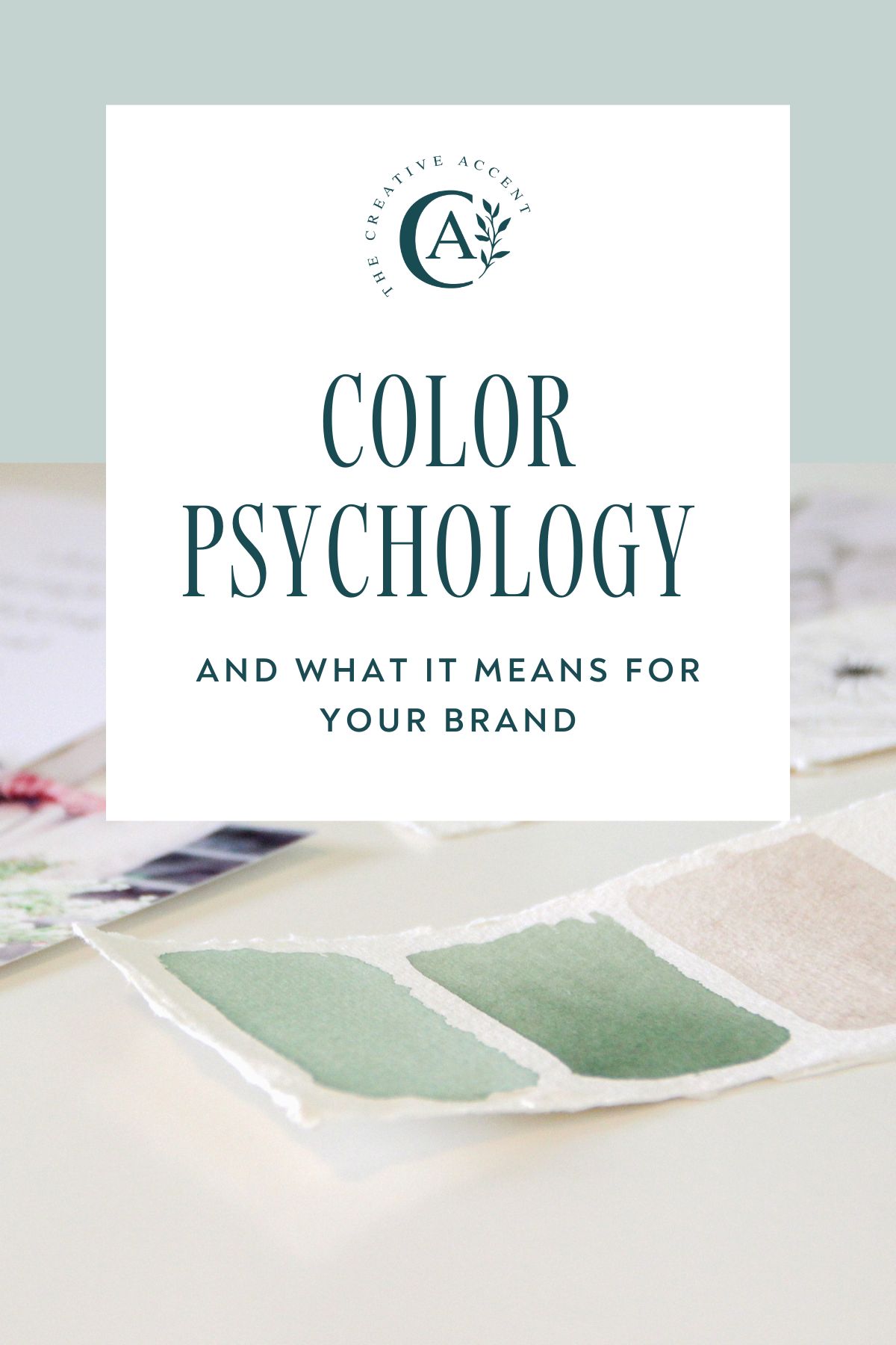
The Psychology of Color in Branding: How Colors Drive Customer Decisions
The Psychology of Color in Branding: How Colors Drive Customer Decisions
Color is one of the most powerful tools in a brand strategist's arsenal. Research shows that color increases brand recognition by up to 80%, and 85% of consumers cite color as the primary reason they buy a product. This influence extends far beyond mere aesthetics—it taps into the psychology of consumers, triggering emotions and associations that can determine their purchasing decisions.
Color Theory for Brands
Understanding the emotional associations of colors is critical for effective branding. Each color carries specific meanings and can elicit distinct feelings among consumers. Here are some key associations:
- Red: Evokes urgency and passion. Brands like Coca-Cola and Target use red to grab attention and encourage impulsive purchases.
- Blue: Conveys trust and stability. Companies like Facebook, IBM, and American Express incorporate blue to foster a sense of reliability.
- Orange: Signals creativity and enthusiasm. Brands like Home Depot and Fanta use orange to create a sense of excitement.
- Green: Represents health and tranquility. Many organic and eco-friendly brands, such as Whole Foods and Starbucks, utilize green to highlight their commitment to sustainability.
- Yellow: Suggests optimism and warmth. Brands like McDonald’s use yellow to create a cheerful atmosphere.
- Purple: Associated with luxury and sophistication. Brands such as Cadbury and Hallmark leverage purple for an upscale appeal.
- Black: Represents elegance and modernity. Brands like Chanel and Nike use black to convey sophistication and power.
By selecting colors that align with these associations, brands can communicate their values and foster a deeper connection with their target audience.
Choosing Your Brand Palette
Select a primary color that aligns with your brand personality, then build a complementary palette with 2-3 supporting colors for versatility across all brand touchpoints. Here’s a practical approach to developing your brand color palette:
Step 1: Define Your Brand Personality
Before selecting colors, take time to define your brand’s personality traits. Are you fun and playful, or are you serious and professional? Conduct a brainstorming session with your team and identify 3-5 key adjectives that describe your brand.
Step 2: Research Color Meanings
Once you have your personality traits, research colors that align with those adjectives. Use the associations outlined above as a starting point and explore shades and tones that resonate with your intended message.
Step 3: Create Your Color Palette
Choose a primary color that strongly represents your brand’s personality. Then, select 2-3 secondary colors that complement the primary. Use online tools like Adobe Color or Coolors to help you visualize combinations. Consider the following:
- Contrast: Ensure that there is enough contrast between colors for accessibility and visibility.
- Versatility: Choose colors that work well across various applications—from digital to print—to maintain brand consistency.
- Mood and Emotion: Ensure that the palette reflects the mood and feelings you want to evoke in your audience.
Implementing Color in Branding
Once you have created your color palette, it is essential to implement it strategically across your branding materials. Here are some key areas to focus on:
1. Logo Design
Your logo is often the first point of contact potential customers have with your brand. Use your primary color prominently in your logo to reinforce brand recognition. For instance, McDonald’s iconic red and yellow logo is easily recognizable worldwide.
2. Website and Digital Presence
On your website, use colors consistently to maintain visual cohesion. The primary color should be prevalent in headers and calls to action, while secondary colors can be used for accents and backgrounds. This not only makes your website visually appealing but also guides user behavior. Consider Dropbox’s clean and straightforward use of blue, which communicates trust and encourages sign-ups.
3. Packaging and Product Design
If you sell physical products, your packaging is an extension of your brand identity. Use your color palette effectively to stand out on shelves. For example, Coca-Cola’s red cans are easily spotted in a sea of products, helping to reinforce brand recognition.
4. Social Media
Social media platforms are great spaces to showcase your brand colors. Use a consistent color palette in your posts, stories, and advertisements. For example, Instagram often utilizes a gradient that is synonymous with its brand, making it instantly recognizable.
The Impact of Cultural Context
It is important to note that color perception can vary significantly across different cultures. What might evoke positivity in one culture could have negative connotations in another. To ensure your brand resonates globally, consider the following tips:
- Research Cultural Interpretations: Take the time to understand how colors are perceived in different cultures. For instance, while white signifies purity in Western cultures, it can represent mourning in some Eastern cultures.
- Test Your Palette: If you plan to target an international market, conduct A/B tests across different regions to explore how your color choices perform.
- Adapt When Necessary: Don’t be afraid to modify your color palette to align with cultural expectations and preferences in different markets.
Real-Life Examples of Effective Color Branding
Countless brands have effectively leveraged color psychology to shape their identities. Here are a few noteworthy examples:
- Starbucks: The green color used by Starbucks signifies growth and renewal, associating the brand with sustainability and environmental responsibility.
- Apple: Apple’s use of sleek, minimalist design and a monochromatic color palette communicates sophistication and high-end technology, appealing to a tech-savvy audience.
- Fanta: The vibrant orange packaging reflects fun and refreshment, attracting a younger demographic looking for a tasty, refreshing drink.
These brands showcase how strategic color choices can effectively communicate a brand's message and attract their target audience.
Conclusion
The psychology of color in branding should not be underestimated. As a powerful tool for influencing consumer perception and behavior, color choices can significantly impact brand recognition and loyalty. By carefully selecting a color palette that aligns with your brand personality and understanding the emotional associations of colors, you can forge deeper connections with your audience and ultimately drive customer decisions.
Always remember, the goal is not just to look good but to create a meaningful impact through your color choices. By taking the time to craft a thoughtful, strategic color palette and implementing it effectively across all touchpoints, you set a foundation for a brand that resonates with consumers and stands the test of time.